Elements
Elements are the building blocks for the Design System. Reusable Molecules that can be placed and joined together to form more complex components and layouts. CSS class names are created using the Block-Element__Modifier (BEM) pattern.
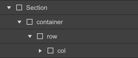
Body-Wrapper and Section
The Body-Wrapper is a block element that holds all elements inside of it and is set to Overflow:Hidden to element any objects breaking outside of the page and forcing a sideways scroll.
The Section element is a Horizontal-Flex__Box set to Center-Center and has side Padding to restrain other components and create gutters on Mobile screens. It is used to hold Content and divide up the page. Top and Bottom Padding creates White Space between Content.
Wrapper-Row
The Wrapper-Row is a Block element without any Padding. A wrapper holds child elements tightly; it wraps them, unlike a container that has padding. Wrappers can be used to hold Card or Grid elements in place.
Container-Row
The Container-Row is a Horizontal-Flex__Box with Padding added as a combo class. It will hold Child Elements in a horizontal row. It can also hold Columns. At Mobile breakpoints it becomes a Vertical-Flex__Box. Columns are Block-Elements or Vertical-Flex__Box with Padding.
Column-Left
Column-Right
Container-Grid
The Container-Grid is a Bootstrap style 12-Column and Auto generated Row grid with 16px gaps. It holds Child Elements Horizontally and Vertically. Set it to maintain the 12-Column grid across all breakpoints, or scale down to fewer Columns on Mobile Landscape and Mobile Portrait.
Responsive Flexbox Grid
Columns need to be nested within a "grid-row" and a direct child of a "container". All columns start off at equal-widths by defining the class of "col" and auto-collapse at the mobile portrait breakpoint if no responsive classes are defined.
Remove Gutters
To remove all padding from columns, use the "no-gutters" class preceded by the initial class of "col".
Full Width Container
Define your div with a class of "container-fluid" for full width.
